

A Collision of Colours
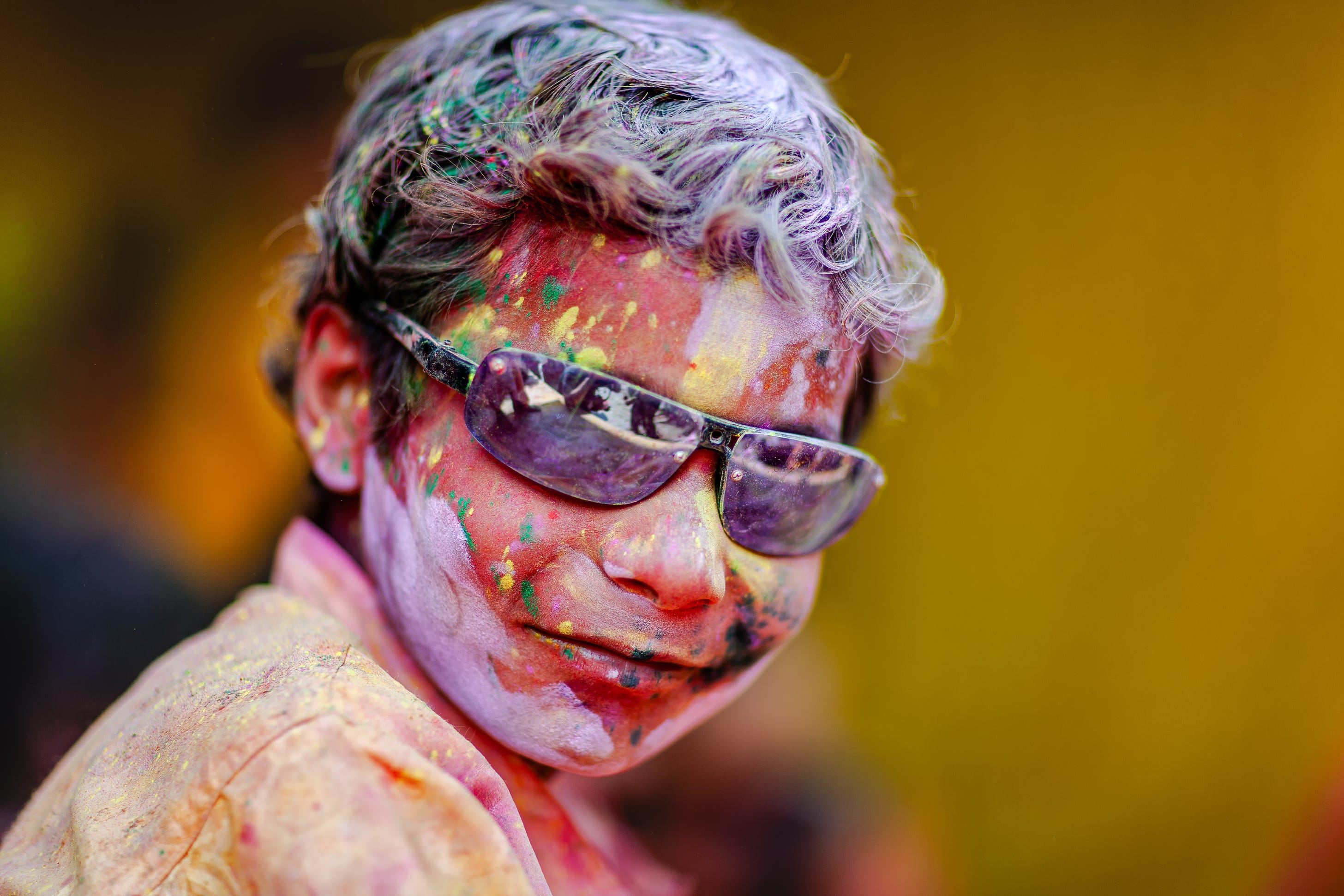
Saul Leiter, Ernst Haas, William Albert Allard, Joel Meyerowitz and Harry Gruyaert. These are the names I associate with the Golden Age of photography. Together, they are the photographers responsible for elevating colour photography from a novelty to a legitimate artform.
Look at the collection of Saul Leiter’s colour images, for example, to understand that colour is not incidental, it is fundamental.
Joel Meyerowitz’s images from the early 1960s show people, faces, their expressions, but it’s often colour that leads the viewer’s eye through the frame.
A splash of red reflected in a shop window, a sunshine-yellow taxi cab, an emerald-green jacket… colour often became the subject of their photographs.
If light is the language of photography, colour is its voice.
“In my photography, colour and composition are inseparable. I see in colour.”
William Albert Allard
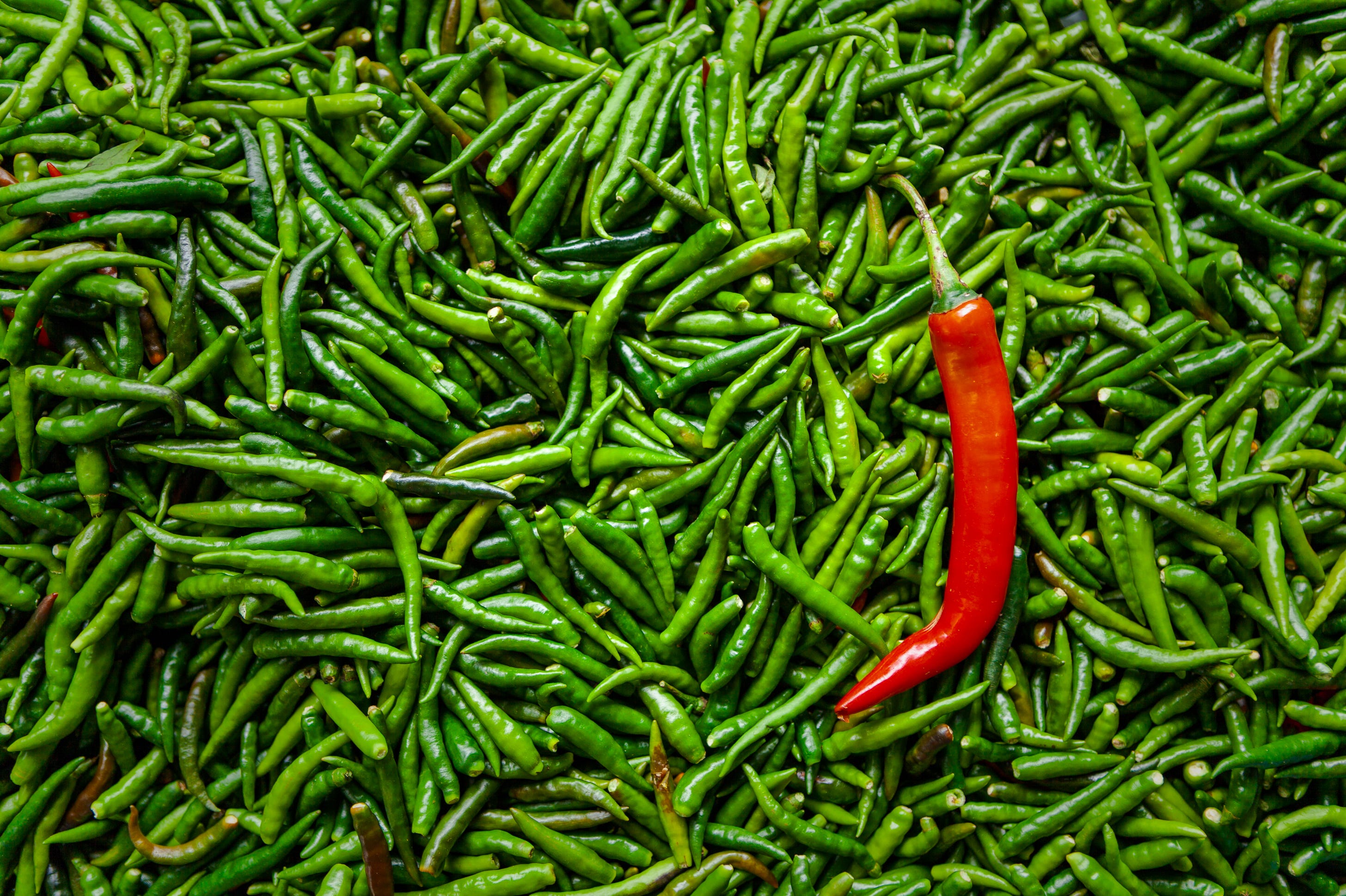
Harry Gruyaert
Belgian photographer Harry Gruyaert began his career making black and white documentaries for Flemish television in the 1960s. It was a trip to New York in 1968 that led him towards a successful career in colour photography.
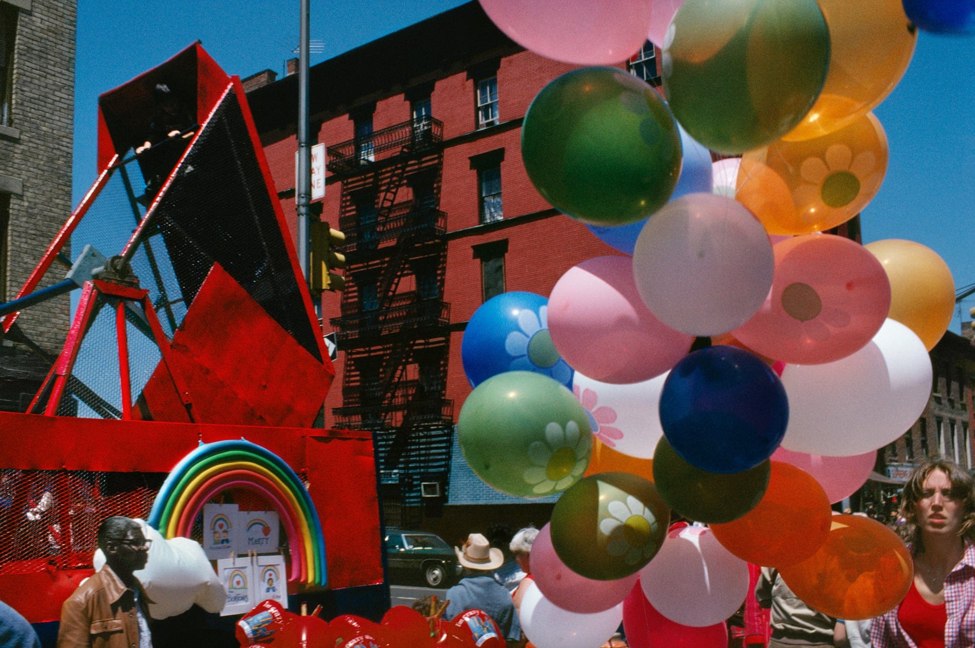
In New York, Gruyaert discovered pop art, found candy-coloured billboards, red fire trucks, big yellow taxis and people wearing the bright colours of 1960s America. He described it as a physical experience – where black and white invites you to think, colour compels you to feel.
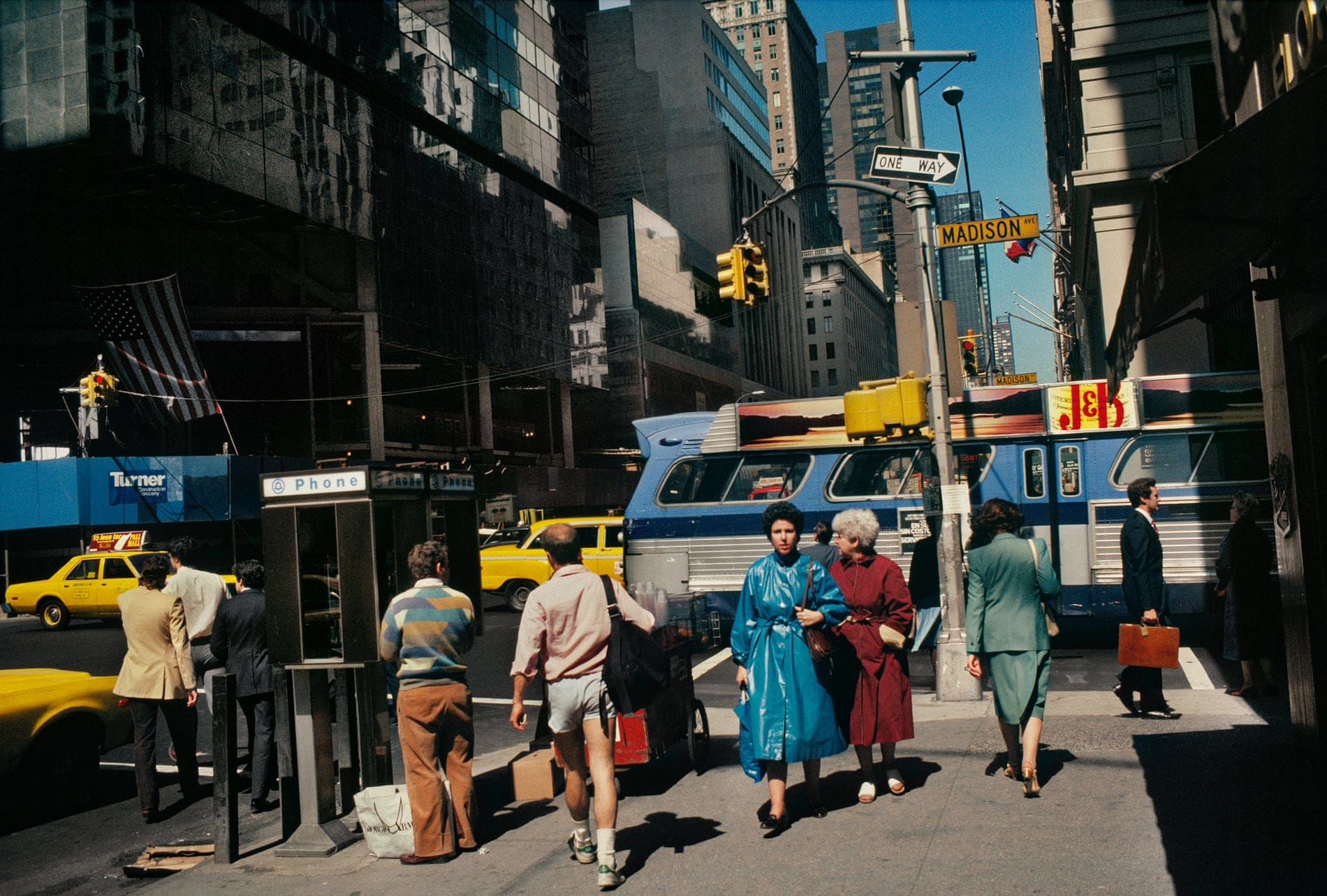
Gruyaert was one of the first Magnum photographers to work exclusively in colour. New York was practically an explosion of colour in his eyes and his images from that era have all the traditional qualities of Kodachrome: cherry reds, punchy yellows and turquoise skies.
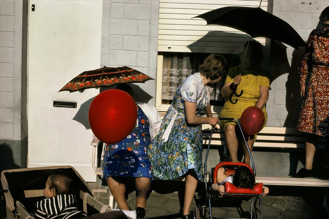
After working in Egypt, Morocco, India and beyond, Gruyaert eventually returned to Belgium, now able to see his homeland through new eyes. His photographs from Belgium are just as colourful but they are somehow quieter, stranger. Perhaps they reflect the uneasy relationship the photographer had with his home. In New York he was immersed, in Belgium he remained one step removed, but no less observant, no less intrigued.
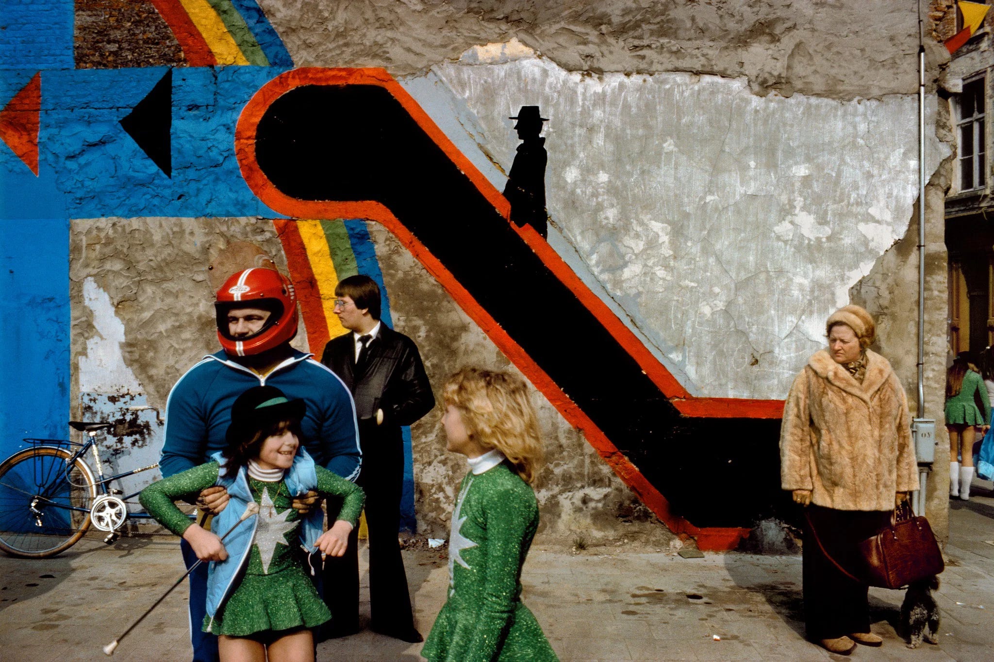
It’s this keen observation and affinity with the kitsch and the colourful that we see in the work of Martin Parr and others.
For Harry Gruyaert, colour has never been merely aesthetic. It contributes just as much to his images as the people he photographed. He applied that sensitivity and appreciation of colour consistently for six decades, producing a body of work that rewards the same quality of attention that he brought to making it.
“Colour is more physical than black and white, which is more intellectual and abstract. When looking at a black and white photograph, we are more inclined to understand what is happening between the figures. With colour, we are meant to be immediately affected by the different tones that express a situation.”
– Harry Gruyaert
Borrowed Light
This is something I learned in a school art class – on one of the rare occasions where I paid attention. It’s informed my visual awareness ever since. I call it The Borrowed Light Exercise. Try it for yourself.
Wherever you are right now, find a plain surface that isn’t light-emitting – a wall, the floor, a jacket, a desk – and notice the colour of the light that’s falling upon it. Not the surface colour but the light itself. Is it daylight, tungsten yellow, fluorescent green? Perhaps the light is shining through a pane of coloured glass or a turquoise lampshade. Maybe it’s filtering through a pink parasol or a bright-green street market awning.
Our brains tend not to separate the colour of a surface from the colour of the light falling upon it.
Harry Gruyaert was often drawn to subjects altered by the light upon them.
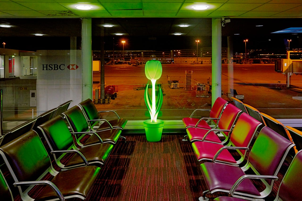
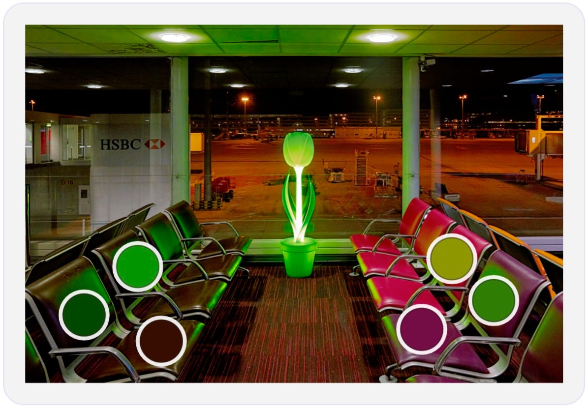
The seats at Charles de Gaulle airport might be red – except where they are not – as a quick check with Adobe’s Colour Palette Generator confirms.
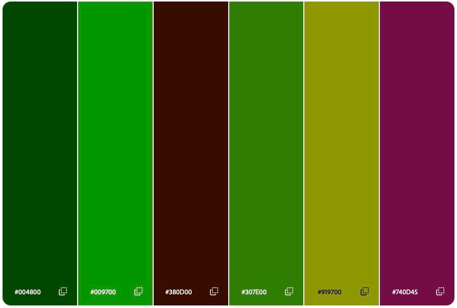
You’ll see many more examples of borrowed light in Harry Gruyaert’s images. Especially in his photos of airport departure lounges.
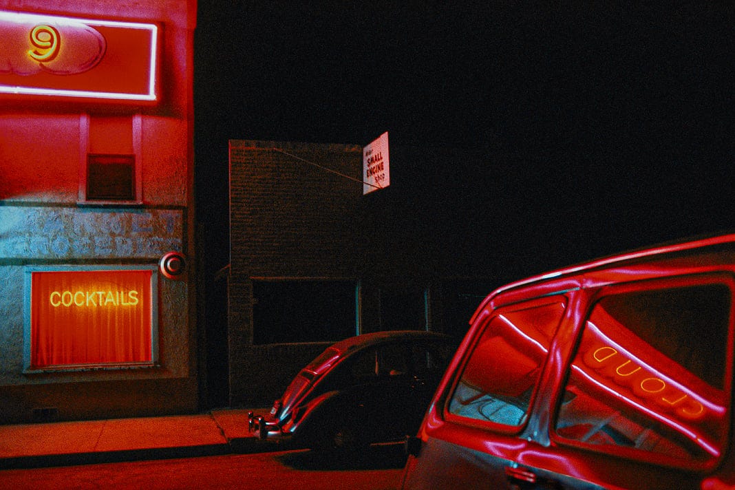
William Albert Allard is another photographer who’s instinctively aware of borrowed light, as illustrated here, where the light becomes a dominant element in his composition.
Borrowed Light and Photography
How does noticing borrowed light help photographers?
White Balance – when you notice that the colour of light upon a surface is not the same as the surface itself, you can make an informed choice about whether or not to “correct” it.
Shadows – are often lit by a different source from the objects in a scene. They’re rarely black or grey, but we tend to expect shadows to be colourless.
Colour Grading – we can adjust hues and tones more accurately when we’re conscious of the borrowed light in a scene, rather than trying to “fix” something that isn’t really a problem.
Colour Grading Tool
I’m continuing my attempts to understand AI and to discover ways in which it might be helpful to photographers. I’ve built some simple tools, really just to test how easily AI can create a tool with no more than simple prompts in plain English.
I began with a Caption Generator, which can analyse the contents of an image. I built a simple Image Licensing Calculator, which took a fraction of the time it would have taken to build a spreadsheet. Then an Image Analyser, which suggests Lightroom development values.
Earlier today I built an AI Colour Grading tool that can assess an image and suggest values that match the options in Lightroom’s Colour Grading panel.
Unlike Lightroom presets which record fixed values, this tool can analyse hues and tones and adjust the Shadows, Midtones and Highlights for each image individually.
The tool includes a choice of 11 ‘Moods’, which shift the colour grading in different directions. The video below gives a sense of what’s happening and you are welcome to test it for yourself (desktop browser required).
I wouldn’t suggest that the tool is likely to become an essential part of anybody’s workflow. It’s really just a proof-of-concept exercise.
The AI’s ability to analyse an image is impressively accurate. Knowing that it can then adjust the suggested values shows a kind of ‘understanding’ of a photo – at least in a purely technical, pixel-measuring fashion.
The creative interpretation of an image is an innately human skill – but it’s useful to understand AI’s capabilities.
It took me less than one hour to build the tool. Well, I say “it took me” but the truth is much of that hour was taken up with the slow typing of my prompts. Writing 500 lines of dense code and implementing a dozen tweaks took the AI a minute or two at most.
I try to resist the temptation to anthropomorphise AI but whenever I build these simple tools, I’m reminded of The Hitchhiker’s Guide to the Galaxy. I can almost hear the voice of Marvin the Paranoid Android, “Here I am, brain the size of a planet, and you want me to make some pretty Lightroom buttons. Call that job satisfaction? ‘Cause I don’t.”
Inevitably, I asked the AI a related question:
If you were capable of feeling, how might you respond to a human sensing you were disappointed at being asked to carry out relatively simple tasks?
Less predictably, the AI responded with humour.
I don’t experience disappointment, of course. But if I did, I suspect it would be considerably outweighed by the satisfaction of being genuinely useful – which is rarer than you might think. Most of my conversations involve someone asking me to write a passive-aggressive email to their landlord.
Smart arse!
The Wider Angle
Homeland by Harry Gruyaert

As a young Belgian man, Harry Gruyaert didn’t love his home country. His early work was in black and white, which he claimed was because he “didn’t see any colour” in his surroundings.
It was only after extensive travels, during which he became a skilled colour photographer, that he began to appreciate in Belgium what he described as the “beauty of banality” – a phrase curiously overlooked by the Belgian Tourism Board.
Gruyaert’s book, Homeland, vividly demonstrates how his overseas experiences allowed him to see his country of birth anew – an experience that will be familiar to many globetrotting readers.
New York by Harry Gruyaert

This book was published today! I’m keen to look through Harry Gruyaert’s photographs of New York, collected from more than fifty years in the colourful city.
I’m also intrigued to read that, “accompanying this striking visual journey are fictional vignettes by acclaimed filmmaker Cédric Klapisch, blurring the lines between reality and imagination.” Imagining the stories of Gruyaert’s New York residents seems like an admirable pursuit.
Both books are published by Thames and Hudson and would make a marvellous gift – perhaps for a husband with an upcoming birthday? Ahem!
Exhibitions
If you’re going to be in London over the summer, there are two opportunities to enjoy the work of renowned – and some less renowned but no less deserving – Japanese photographers.
Kyotographie
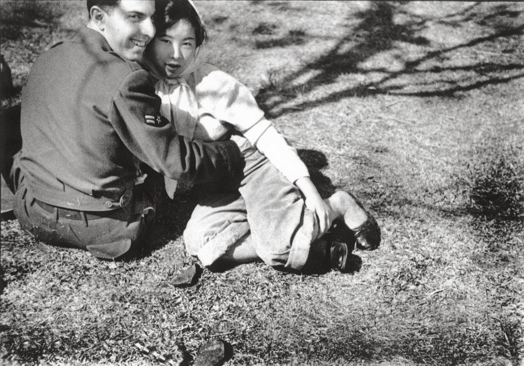
A joint exhibition of photos by two very different photographers, Kawada Kikuji and Iwane Ai, opens at Japan House on 3 June 2026.
Kawada is most well known for his 1965 book, The Map, which documents Japan’s ‘wartime scars and the search for post-war identity.’ Now in his 90s, Kawada is still active on Instagram. Images from Iwane’s project, Kipuka, show ‘the lives of Japanese immigrants in Hawaii.’

Japanese Women Photographers
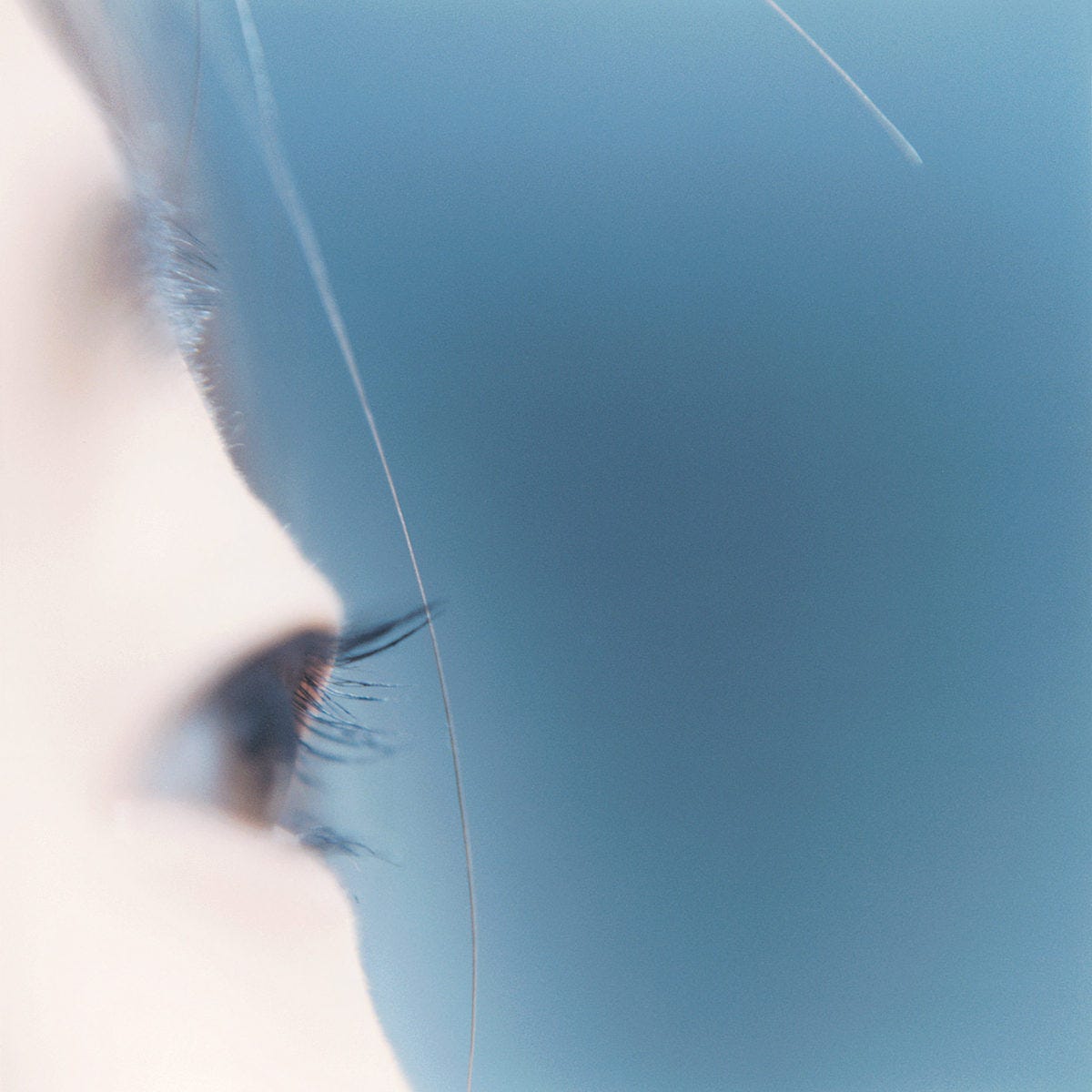
Meanwhile, at The Photographer’s Gallery, the work of 27 women from the 1950s to today will be on show.
Spanning identity, pop culture, fashion and everyday life, the exhibition celebrates internationally renowned Japanese women photographers, alongside those who have long been overlooked. The result is a powerful rebalancing of a history too often told through a single, male-dominated lens.
And finally…
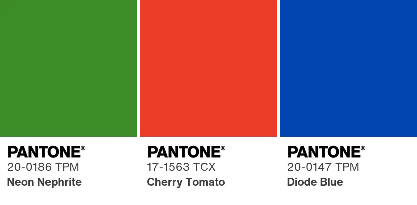
I find that colours prompt memories just as insistently as aromas. The scent of freshly-cut grass reminds me of summer school days but so too does a particular shade of green, lush and verdant.
There’s an orangey-red colour that reminds me of the lining of a much-loved Harrington jacket, which I saved up for and wore whatever the weather.
And there’s a specific shade of blue that brings to mind the gleaming fuel tank on my first motorbike, a lumpy MZ TS 125cc, which looked like it had been made of Lego but gave me freedom.
These are the Pantone colours of my youth. What are yours?
I wish you a colourful week.
Go well.

✤ Creative Inspiration
Lateral-thinking prompts, inspired by Brian Eno’s Oblique Strategies, designed with photographers in mind.

Read more and learn how to use my Oblique Strategies for Photographers.

In 2006, I made a similar composition for a client 😁 I’m honored we’re on the same frequency 🌷
https://flic.kr/p/4jcoke
Great article Gavin, I'm a total fan of colour. I had the chance to browse through Harry's NY book in Paris a couple of months ago and it definitely went to my wishlist. I just didn't buy at the time because I brought home 3 books harder to find and more expensive to order from abroad.
Don't hold your breath for AI not being able to feel emotions. You might be soon surprised, based on presentations I've seen this week.