Visual Weight in Photography – Beyond the Frame 81/
Understanding “visual weight”. Exploring black cowboy culture. A significant Robert Capa exhibition. Plus news of an extra bonus for Founding Members.
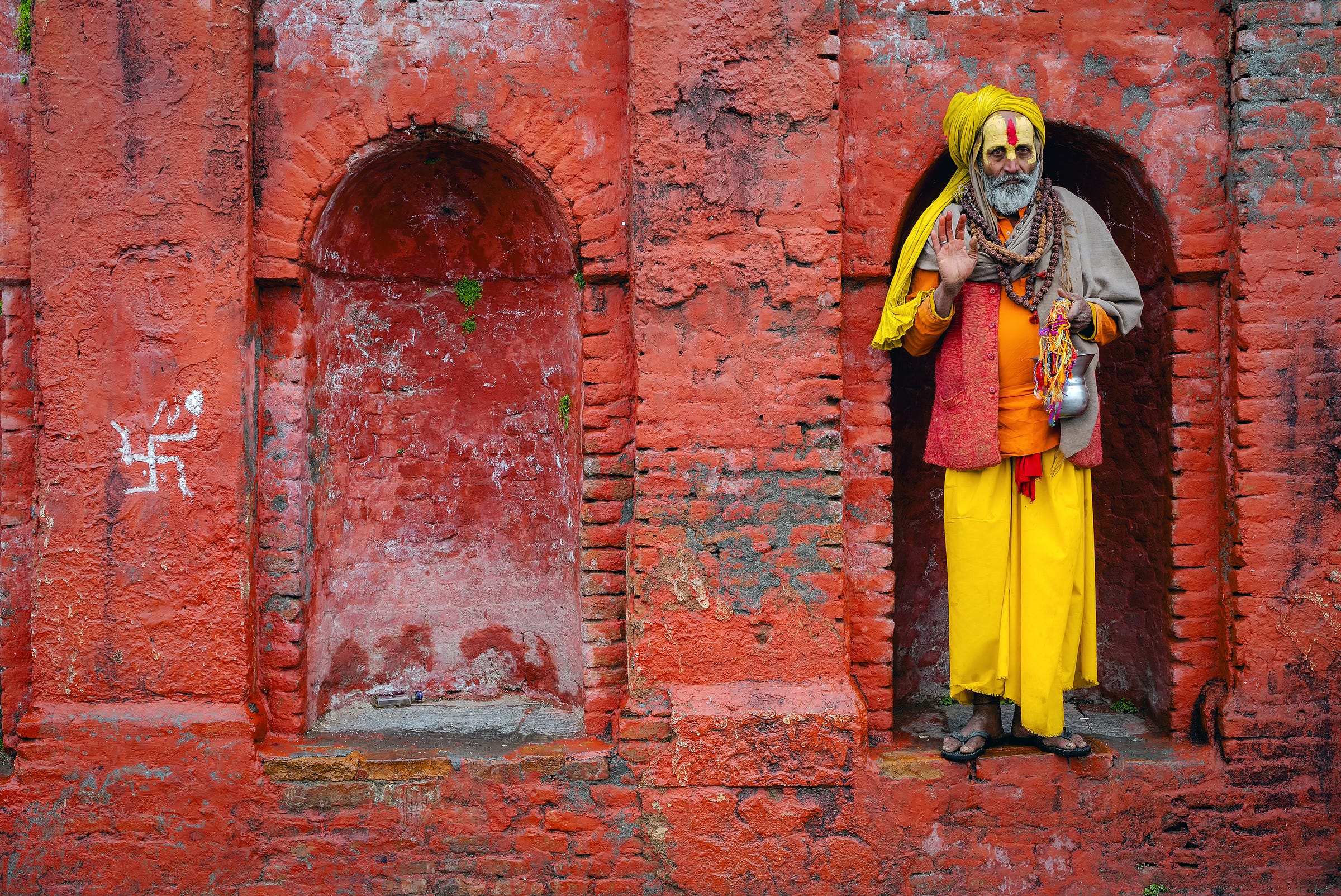
Visual Weight in Kathmandu
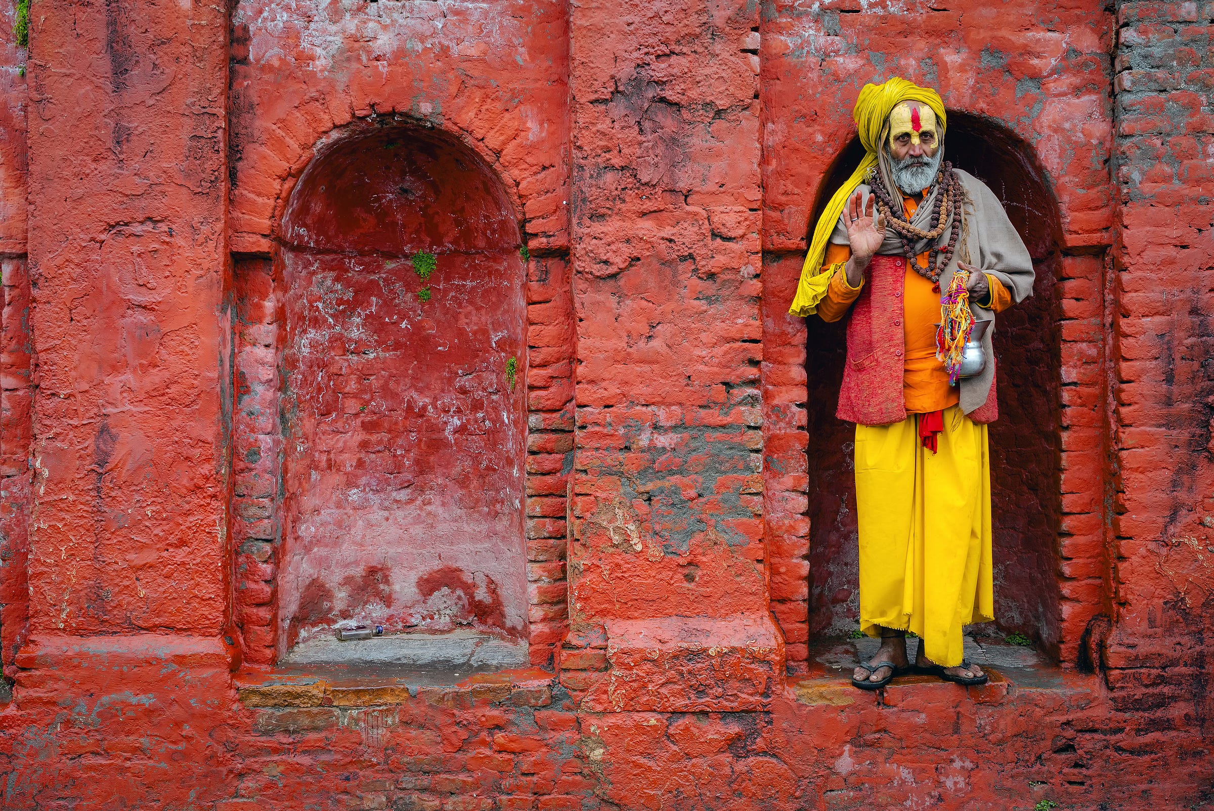
Pashupatinath is situated on the banks of the sacred Bagmati River in Kathmandu. It is home to the most revered temple in Nepal, a popular pilgrimage destination and a sacred site for riverside cremations.
Visitors to Pashupatinath are likely to encounter sadhus – Hindu holy men who have renounced an earthbound life in pursuit of spiritual discipline and liberation from the cycle of birth and death. Some wear only a simple dhoti or loincloth; some wear nothing at all. Others are dressed in saffron and yellow robes, their faces marked with elaborate tilak decorations made from sacred ash (vibhuti), sandalwood paste (chandan) and vermilion (sindoor or kumkum).
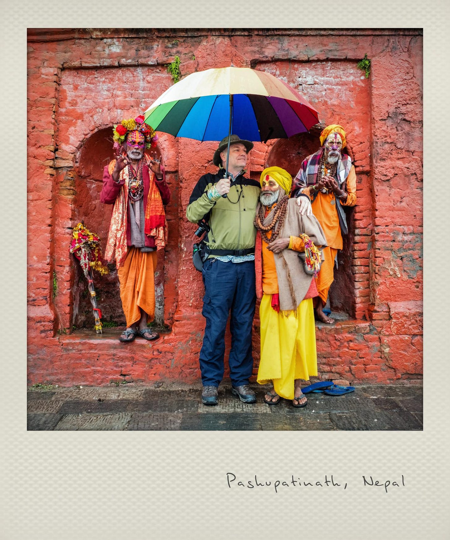
Some Sadhus occupy a more performative role, readily posing for photographs beside a colourful temple wall in exchange for a small donation. The distinction between devoted ascetic and tourist-pleasing sadhu is not always clear – but a polite commercial exchange probably never harmed anybody’s search for spiritual enlightenment.
Visual Weight in photography
Something I find interesting about this picture relates to what we call visual weight: the elements in a frame that draw our eye. Visual weight dictates our instinctive response to an image.
Human vision is not neutral. What attracts our attention has been shaped by evolution and culture.
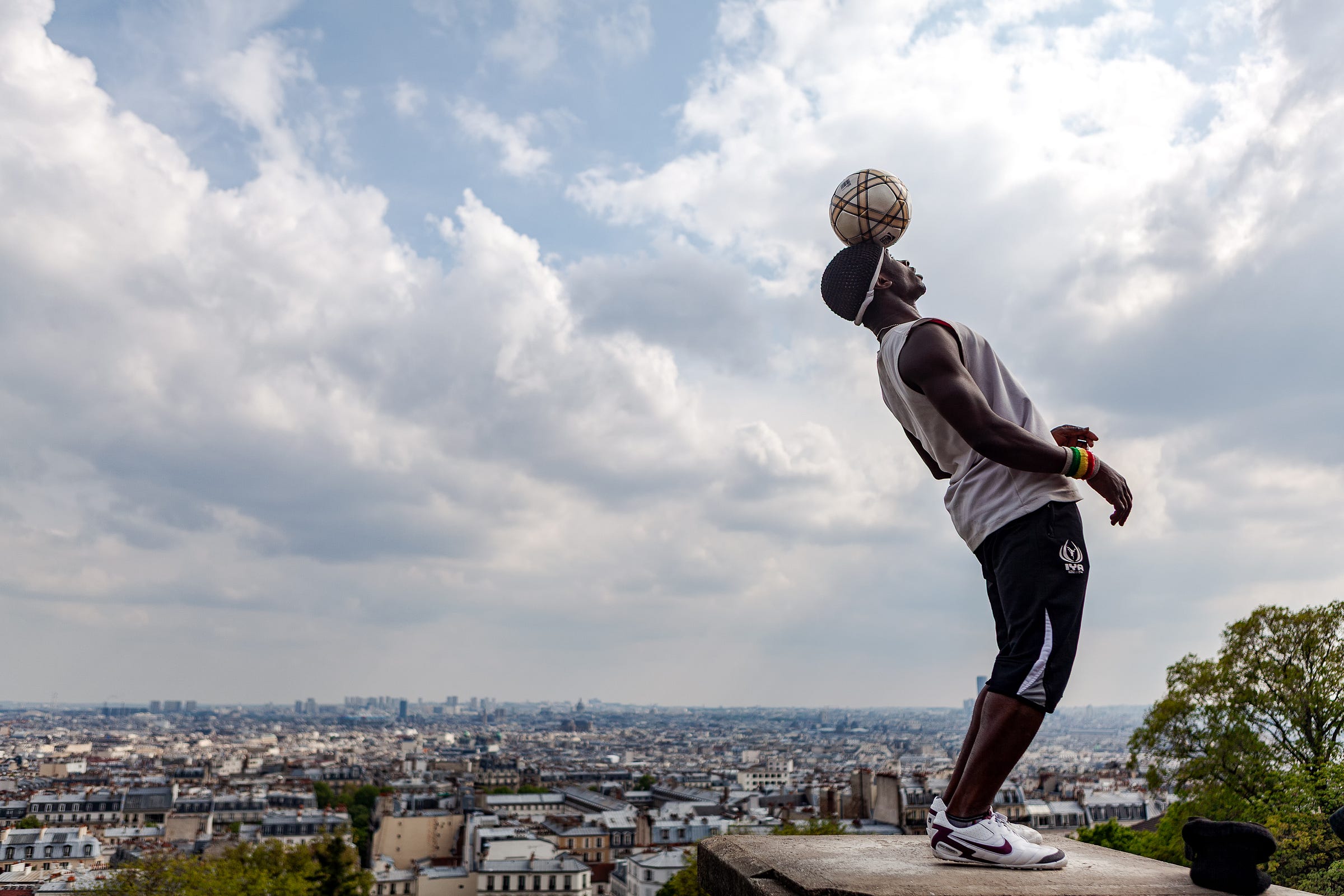
If there’s a human face in a frame, we will almost invariably look at that first. Swift recognition of faces is hard-wired into our brains. Our gaze is also drawn to areas of sharp focus and strong contrast. Bold colours have considerable visual weight and a saturated component will always outweigh muted tones.
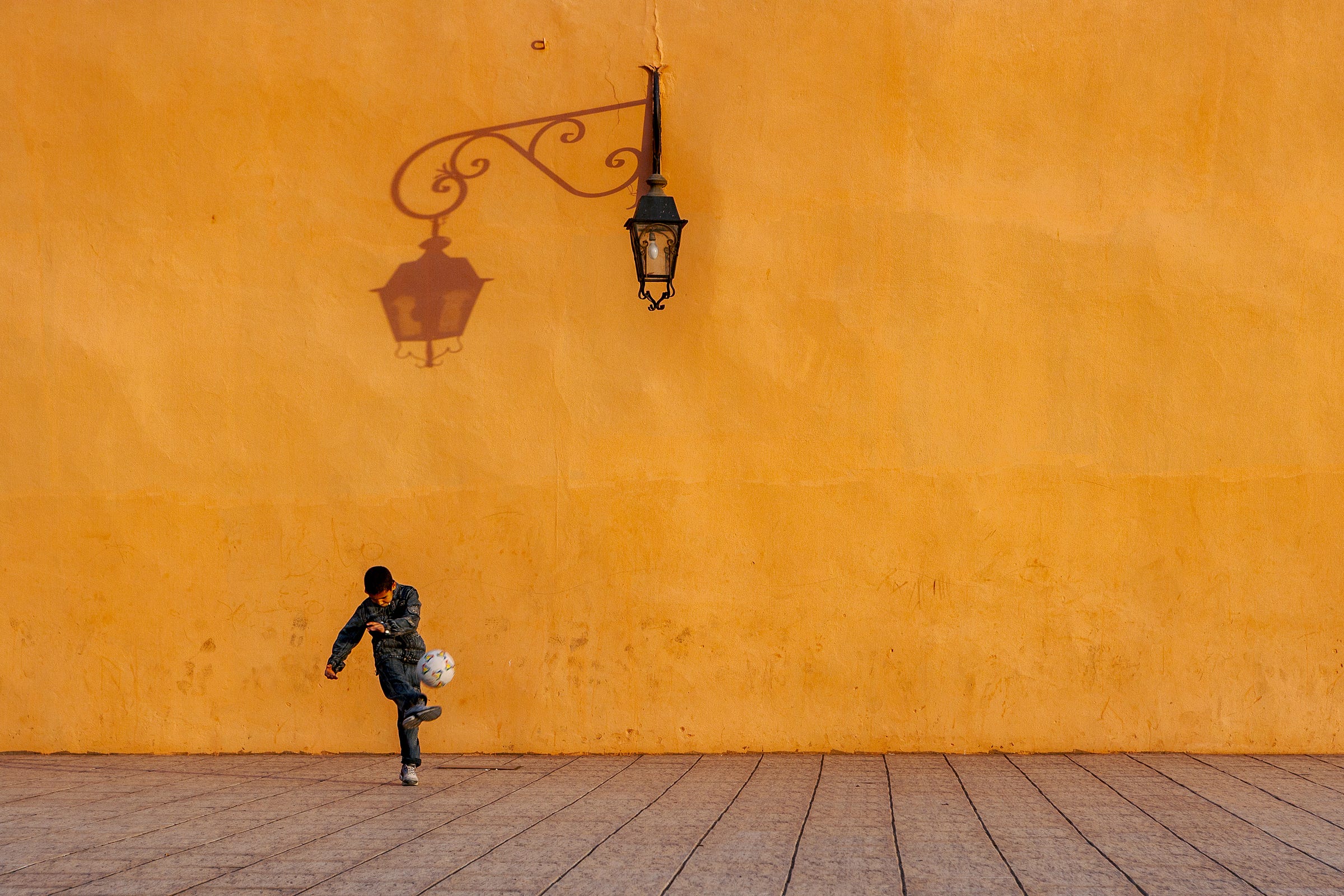
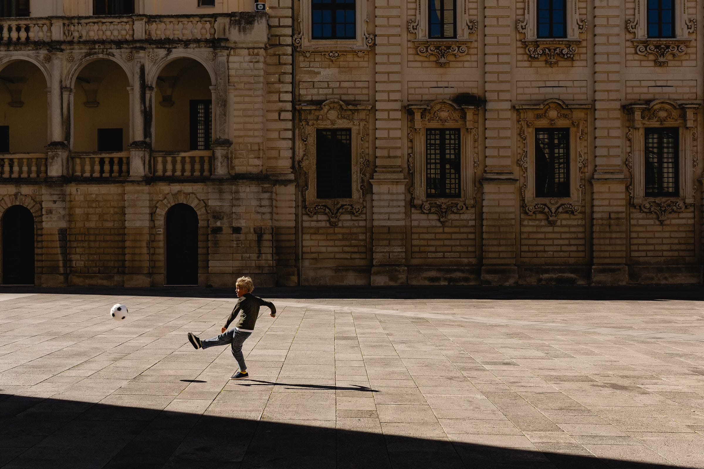
Isolated figures gain visual weight by virtue of being alone; they stand out against the negative space of blank walls or repeating patterns.
Less weighty but still tipping the scales: gestures, familiar symbols (especially political or religious), and expectation-defying inconsistencies (like a mask or painted face).
Our initial scan happens in the blink of an eye. By the time we’ve engaged a conscious gaze, our eyes and brain have already completed an initial sweep, seeking out the familiar. This, supposedly, has evolved from our attempts to avoid being eaten by wolves and tigers.
Examples
In these examples, the elements with greatest visual weight are easy to identify.
An exception to prove the rule
The picture of the sadhu in Kathmandu appears to possess many of the ingredients necessary for strong visual weight:
Human face ✅
Bold colours ✅
Isolated against negative space ✅
Gesture ✅
Religious symbol ✅
Unexpected element (face paint) ✅
And yet…
Even though our eyes might initially land on the sadhu standing in the alcove, there is another element that arguably possesses even greater visual mass. It’s not a face, it isn’t colourful, and it’s relatively small – but it carries a cultural significance that is considerably weightier than the holy man.
By now, I’m certain you will have noticed the swastika symbol. Your reaction will almost certainly have been influenced by your age and the place where you grew up.
If you are Indian or Nepalese, you’ll most likely see an auspicious symbol conveying good fortune or wellbeing. You might pay little attention to it, being used to seeing it painted on the walls of homes and temples, on shopfronts, cars and trucks. It’s a symbol that’s a part of the visual fabric of everyday life in many Asian countries – and has been for at least 3,000 years.
If you grew up in Europe or the USA, your eyes might also be drawn to the swastika. But the cultural significance of the symbol that German Nazis appropriated in the 1920s might evoke a very different reaction.
The German National Socialist swastika was rotated, repurposed and weaponised to represent a racist, totalitarian ideology. That version of the swastika is banned in several European countries and even where it’s not illegal, it carries grim associations of hatred, intolerance and genocide.
To state the obvious, symbols don’t get any weightier than a swastika.
Even where it appears in an entirely peaceful and well-meaning context, we bring our own baggage and interpretations to the symbol. For me, even typing the symbol’s name feels uncomfortable.
If you have a strong reaction to the swastika, it probably influences how you react to the picture as a whole. It’s an image that would be unlikely to sell as a stock photograph to a Western outlet – and if it were licensed, I’d fully expect a client to ask for the symbol to be removed.
Does the photo look very different without the swastika? If you’d never seen the original version above, you might find the edited version to be a perfectly innocent image.
But having seen the original, does the version without the swastika still feel tainted?
I was surprised when I first saw swastikas in Asia. And the symbol really is ubiquitous in many countries. I’ve since learned its true origins but, even so, I still instinctively crop it out when I’m framing compositions.
However, I deliberately included it in my original composition in order to illustrate the point about visual weight – and how, ultimately, that is dictated by the audience.
At this point, I feel like I’ve taken the largest of mallets to crack a tiny walnut. I’m sure you get my point.
A camera shutter opens for a fraction of a second but the resulting image lasts a lifetime or more, available for close and lengthy inspection.
Yes, we can follow the advice to “always check the edges of the frame” and do our best to see what other elements might have unexpected visual weight. For landscape and studio photographers, that’s a big part of the skill set. On the street, it’s a luxury we rarely have – but it is an instinct that can be developed with practice.
The results can only be fully appreciated in the edit, when the image is on a screen or a print. We should never assume that what we believe is the main subject won’t be relegated to a walk-on part, outweighed by something unnoticed but profound.
Visually speaking, the most obvious thing does not always weigh the most.
No prizes for guessing what weighs the most in this picture - literally, if not visually.
The things that are close to you are the things that you can photograph best. And unless you photograph what you love, you’re not gonna make good art.
– Sally Mann
Beyond the Frame Recommendations
Articles, documentaries, exhibitions, podcasts and more.
⦿ Learn
I’m pleased to announce that all Founding Member subscribers to Beyond the Frame now receive a full, six-month subscription to the Darkroom Rumour film library.
The Darkroom Rumour is an online library of handpicked photography documentaries. The library includes many fascinating films, including the story of rediscovering lost negatives of Robert Capa and Gerda Taro, a touching insight into the life and work of Saul Leiter, a thought-provoking film about Sally Mann, and dozens more.
Founding Member benefits now include:
All editions of Beyond the Frame + exclusive Founding Member editions
100% discount on digital products (e.g. Kodachrome presets worth €89)
Six-month subscription to the Darkroom Rumour (worth €60)
Pack of ten fine art postcards (€19.99)
Founding Member subscriptions cost €120 (£105/$135) per year. As well as supporting Beyond the Frame, I hope I’m making a Founding Member subscription good value for money.
◉ Listen
Ivan McClellan on Photo Country
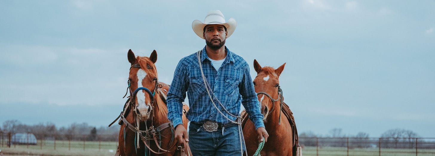
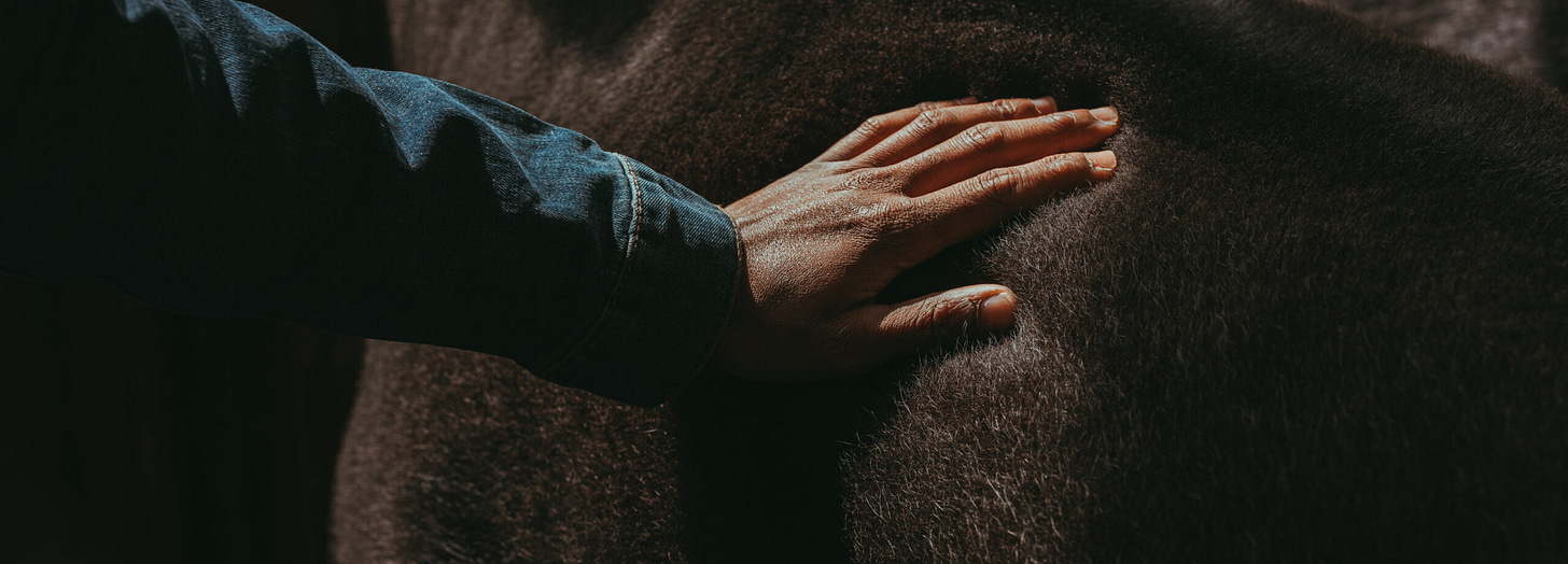
Ivan McClellan’s interview on the Photo Country podcast was an education for me. I had no idea, for example, that 1 in 4 cowboys in the early days of the Wild West were black. But then my education about the Wild West was limited to John Wayne films.
Ivan speaks about the overlap of black culture and cowboy culture. The interview provides a fascinating and informative insight into a world that I must confess I knew little about. It’s a great example of what a thoughtful podcast can deliver.
“I really do believe that joy is an act of rebellion… it’s the most powerful thing that you can do: to say to those that want to control us, or to those that want to destroy our spirits, or destroy our environment, ‘No’. We’re going to come together as a community and we’re going to absolutely celebrate something that we’re collectively excited about.” – Ivan McClellan
☆ Read
Eight seconds - Black Cowboys in America
McClellan’s website portfolio shares images of black cowboy culture. I recommend taking a few moments to enjoy the gallery on the Artworks page. You can also follow Ivan and the Eight Seconds project on Instagram.
“The cowboy has always been a symbol of freedom. My work insists that Black folks belong in that symbol, that we’ve always been there, reins in hand, boots in stirrups, eyes cast on the wide-open sky.”
▶︎ Watch
Concrete Cowboy
The Idris Elba film mentioned in the podcast, Concrete Cowboy, is based on the real-life Fletcher Street Cowboys, a century-old community of black-owned stables in Philadelphia.
The film is available to stream on Netflix and you can read more about the Fletcher Street Urban Riders in this article in Time magazine.
❖ See
Robert Capa. ICONS in Madrid
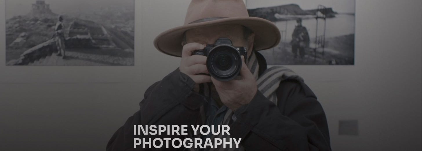
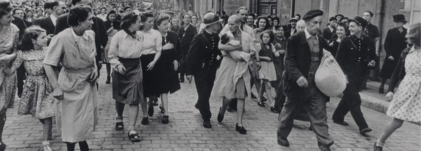
The largest retrospective of Robert Capa’s photographs in Spain can be seen at the Círculo de Bellas Artes in Madrid until 25 January 2026. The collection includes more than 250 pieces: photographs, articles and Capa’s personal belongings, many from the Magnum archives.
The cropped image above comes from Capa’s photo of a woman (Simone Touseau), surrounded by a large crowd. She is carrying her baby daughter along a street in Chartres, France, in August 1944. Touseau’s head has been shaved as retribution for her collaborating with the Germans during World War II.
I never read about Capa and his professional and romantic partner, Gerda Taro without being reminded of alt-J’s song, Taro, and the YouTube fan video, made with footage from the film Powaqqatsi.
There’s a lot to unpack in that paragraph. Maybe just enjoy the video.
If you happen to be in Madrid next month, I’d say the Capa ICONS exhibition counts as a must-see.
✤ Create
A series of creative prompts, inspired by Brian Eno’s Oblique Strategies, and designed with photographers in mind.
Read more about the concept and learn how to use my Oblique Strategies for Photographers.
And finally…
Next week, I plan to bring you my round up of 2025. My personal selection of my favourite camera gear, most memorable photographic moments, most inspiring photo projects, favourite photo book… also the best joke of 2025, courtesy of the comedian I live with.
I wish you a very merry Christmas.
Until next time, go well.




Great read. I have some images with the swastika, from India. Indeed, as far as I can remember, 0 sales from those.
Let me add one more visual weight element, if you don’t mind. One of my mentors, once told me that bright spots in an image, drive the eye there. I guess you can kind of mix that with the pungency of color. It’s an interesting subject to study.
Wishing you happy holidays!